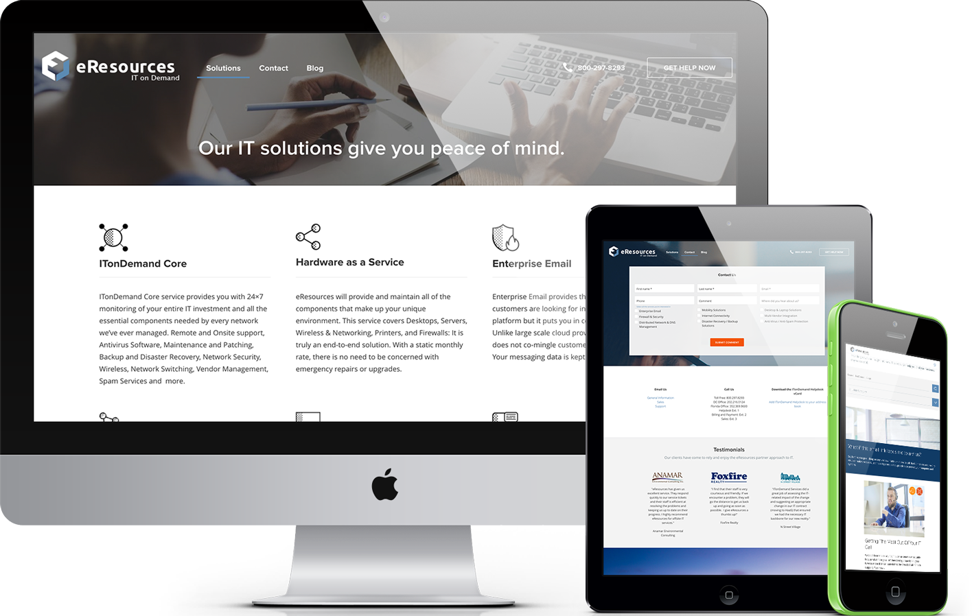
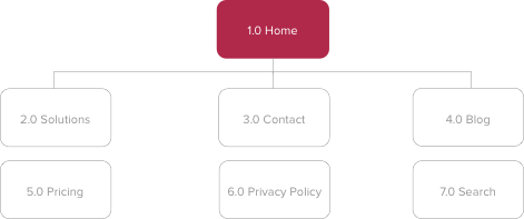
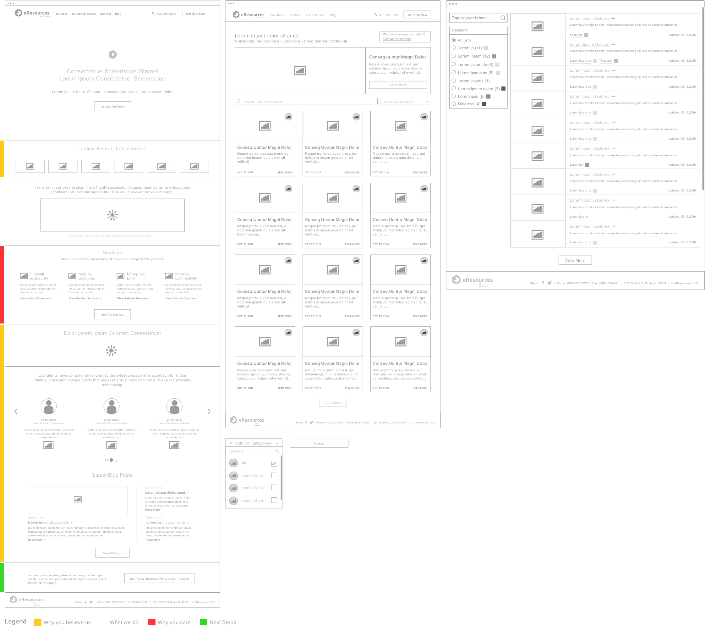
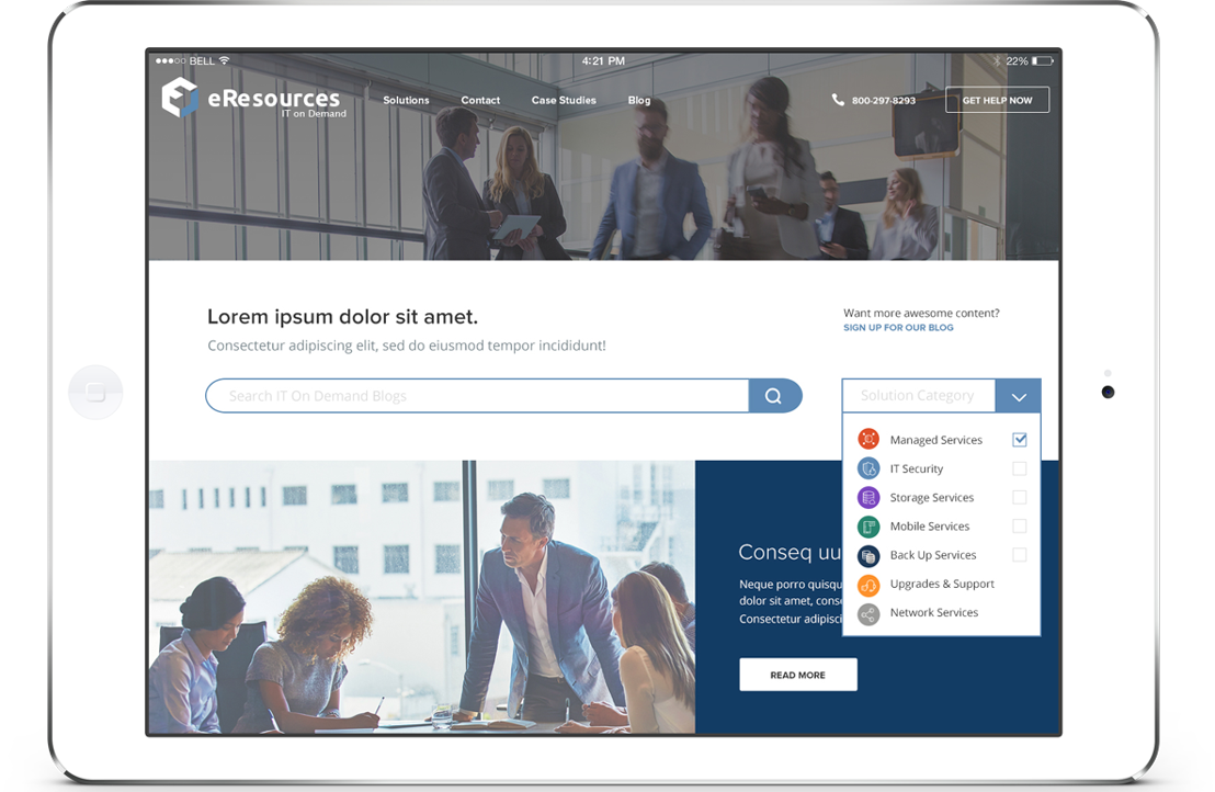
eResources is a full-service technology firm. As the lead UX/UI designer my task was to create a fresh new architecture and design for their IT on Demand microsite. In particular the client wanted me to to simplify navigation, showcase all their IT solutions and structure their blog to optimize for content discovery.
Technologies
  • SKETCH
  • PHOTOSHOP
  • INVISION
  • BOOTSTRAP GRID
Solutions Provided
  • RESEARCH
  • INFORMATION ARCHITECTURE
  • INTERACTION DESIGN
  • VISUAL DESIGN
01
Research
During the discovery phase I scoped the project's UX/UI effort, conducted an analytics review and took a good hard look at the competition. Behavioral data collected by Google Analytics showed how users were interacting with the site and where they were dropping off.
Analytics Review
Finding meaningful patterns in data.
Gathering inspiration
Canvassing the industry.
Site organization
Logical, streamlined architecture.
02
Information Architecture
The IA challenge was to simplify the navigation for the target audience. In the old site information was placed in a disjointed and unintuitive way. The proposed sitemap and navigation helped guide the user to the correct page with minimal cognitive effort.
03
Interaction Design
Wireframes
This stage involved analyzing how content will be structured, where data will come from and how functionality will be developed. The wireframes also documented how the page will be laid out and which areas will receive more emphasis.
Multiple wireframes
From left to right: Homepage, Blog grid layout, Blog list layout.
Homepage
The homepage wireframe has a legend explaining the overall story that is being told by the layout. Visually documenting this helped focus and align the client during presentations.
Search and filter
Each blog category has an associated icon which is displayed on the card. Testing confirmed that this helped the user to quickly scan and identify each article's category. The user can select multiple categories at a time via the dropdown. The dropdown would indicate the options selected via the label “{n} categories selected” A 'Reset' button appears near the filter header once the user has selected at least one filter and shifted focus.
Scalability
The wireframes considers scalability: if in the future eResources has more than 7 article categories a search input would be included in the dropdown. This would allow users to efficiently lookup options.
04
Visual Design
After completing the UX stage, I translated the wireframes into a polished user interface. The Brand Guide gave some direction in terms of suggested color usage but the client was receptive to additions and tweaks.
I used Proxima Nova for body text due to its legibility and sincere nature.
I added an additional blue for action items to give a tech-y feeling.
Colors used
Introduced a few additional secondary colors.
Final design
The designs went through stakeholder reviews.
05
Responsive
Throughout the wireframing, design and development process the layout and components within it were optimized to adapt to any device, screen, and resolution.
Content was prioritized intelligently so users can find what they need on any screen size.
Performance was considered when devising components to be used within the layout.
We strived for consistent user experience accross a number of devices.
06
Results
This was a high impact project with a hard deadline. I was able to meet all due dates and in the end, I delivered clean PSDs to the eResources Development team. It was rewarding to be able to apply both my UX and UI design skills.
Be inspiring
SEE ALL PROJECTS