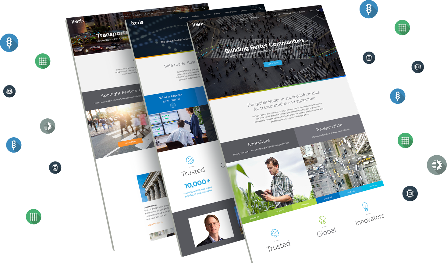
Iteris is a global leader in applied informatics for transportation and agriculture. The company was growing so new products and departments needed to be represented. The project was divided into multiple phases, I led the UX during Phase 1 and was supported by a team of 3, comprised of 2 Visual Designers and a PM. View live site.
Technologies
  • HTML5/CSS3/LESS
  • JAVASCRIPT/JQUERY
  • PHOTOSHOP
  • SKETCH
Solutions Provided
  • RESEARCH
  • INFORMATION ARCHITECTURE
  • INTERACTION DESIGN
  • VISUAL DESIGN/PROTOTYPE
01
Research
I dug deep into the analytics data. Google Analytics provided a wealth of historical data that was summarized in Behavior Flow and Navigation Summary reports. In addition, I created persona profiles that I referred to throughout the project; understanding the audience helped to optimize the application's UX.
Building for real people
Fully fleshed-out set of personas

Pageviews tracking

Basic information about the users.

Behavior flow

Navigation insight and visualization.

Heat Maps

Identify site's engaging areas.

List of KPIs

Monitor impact of the redesign.

Understanding analytics
KPIs were identified and thoroughly examined.
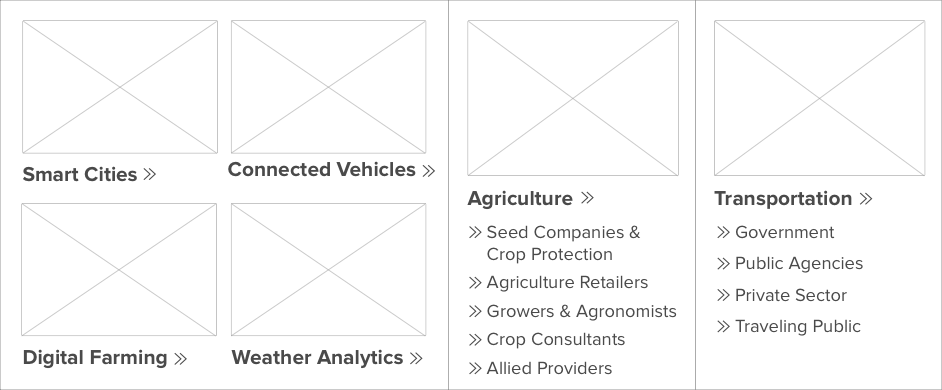
Solutions dropdown
Topic based classification worked well for Iteris.
02
Information Architecture
My goal was to organize, optimize and merge the Iteris and ClearAg sites so that all content could be found in an intuitive way. Before I begun creating the new architecture I briefed myself on the business goals behind the web site and the resources available for design and implementation. I also gathered information about the nature and volume of the content that existed on the live site and how that might change in the near future. Lastly, I questioned the stakeholders about the needs of the audience.
Throughout this process I engaged with Iteris, involving them in decision making and requesting their expertise when needed. We worked together to solve problems.
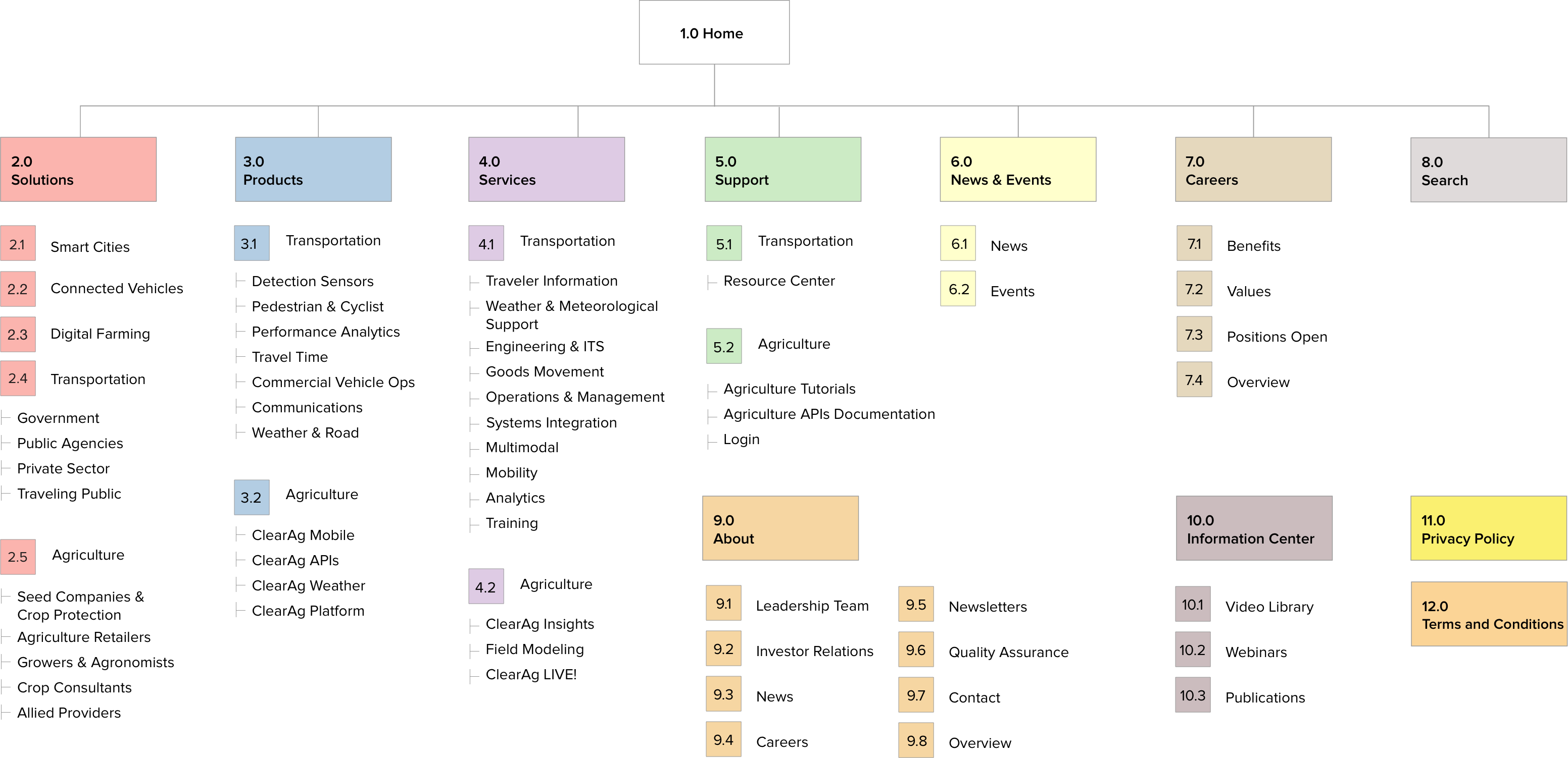
Proposed sitemap
Moving towards a well designed hierarchy.
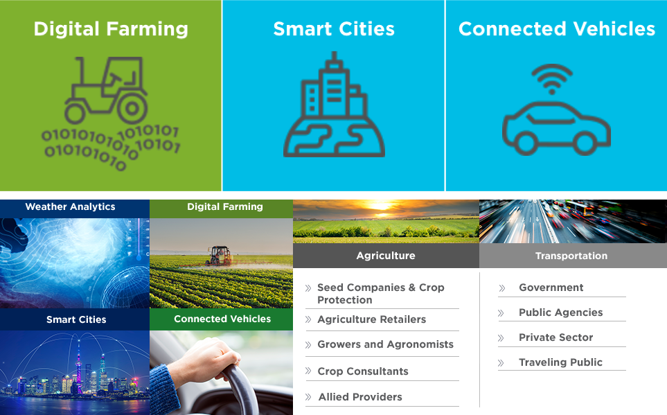
The process of optimizing the architecture involved picking an effective organization scheme for the extensive list of products and solutions. The options that I evaluated included topical, task-oriented, audience-specific and hybrid organization. In the end we chose topic based navigation for both Products and Solutions, this navigation scheme lead readers from a broader topic to more specific topics, which models the way the majority of humans naturally search for information.
03
Interaction Design
Wireframes
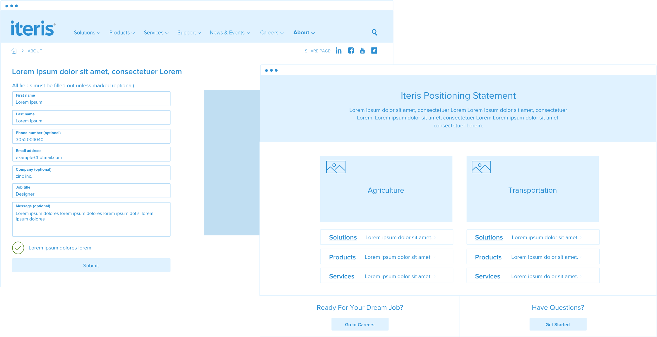
Once I had a solid information architecture, I began to produce the wireframes. My detailed wireframes were the cornerstones of the graphic design and development process. By wireframing in monochrome, the stakeholders could focus solely on the user experience, interactions design, information architecture and data hierarchy.
UX decisions
Wireframes balanced user and business needs.
During the wireframing stage I created my own set of symbols and components that we used throughout. This gave a level of consistency to all the wireframes, allowed any other UX designer to easily start wireframing Iteris pages and made it easier for designers to scan and understand what symbols/components represented. Moreover, all wireframes were carefully annotated with UX and design notes. The notes gave ample justification for UX decisions and also allowed UI designers to know if clients had strong opinions about the layout. Detailed documentation ensured that information was not lost during handoffs.
04
Visual Design
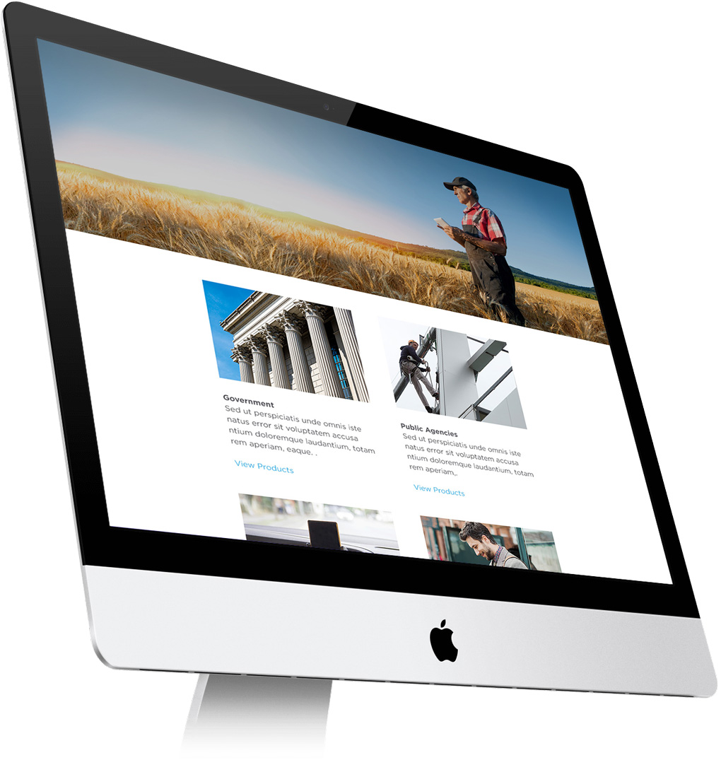
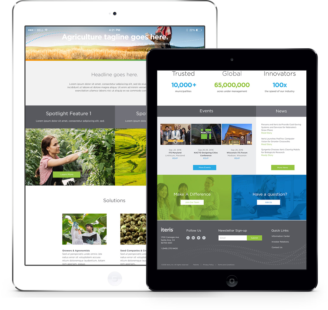
During the visual design phase, I worked directly with one of the senior designers. The designer used a mix of clean lines, suitable typography, bold colors and unique imagery to create a gorgeous website.
I involved the UI team in wireframe meetings so they were familiar with all UX decisions.
I elicited feedback from UI designers to improve handoffs.
I reviewed the UI design to make sure that UX best practices were maintained.
05
Accessibility
A report published by the United Nations in 2011 estimated there were 1.3 billion people with disabilities in the world. Accessibility and device compatibility are crucial UX consideration. The wireframes and interactions I made had to be responsive and follow the Web Content Accessibility Guidelines (WCAG). During the design phase I encouraged designers to use an accessible color palette, account for color contrast ratios and make the final design touch friendly. Moreover the website's code needed to be compatible with devices like screen readers.
By keeping all the aforesaid points in mind, we designed a website that is not only aesthetically clean and appealing, but also accessible.
06
Results
The deadlines were aggressive for this project, and I found myself regularly learning new things and re-working the design or architecture as a result. In the end, we were able enhance content readability and consumption. These improvements increased user interaction, site visit duration, and quantity of content consumed.
Be outstanding
SEE ALL PROJECTS