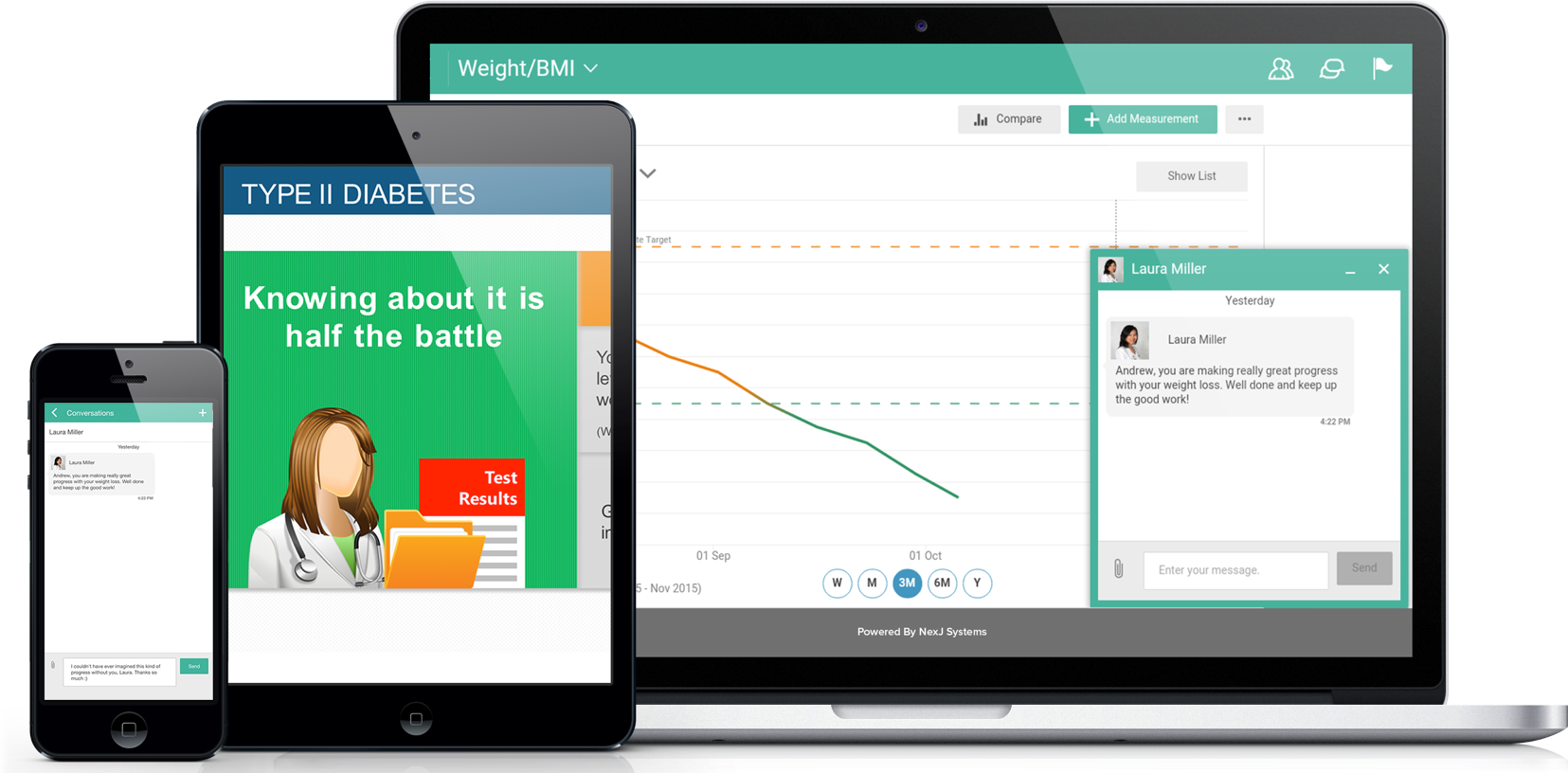
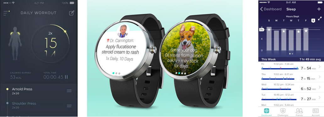
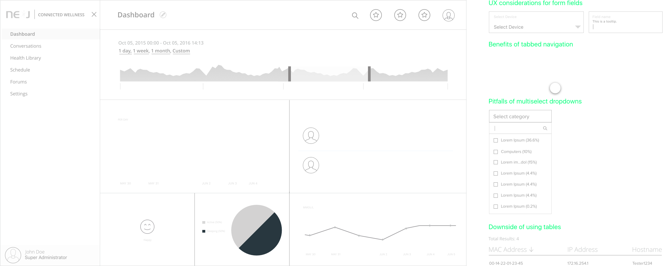
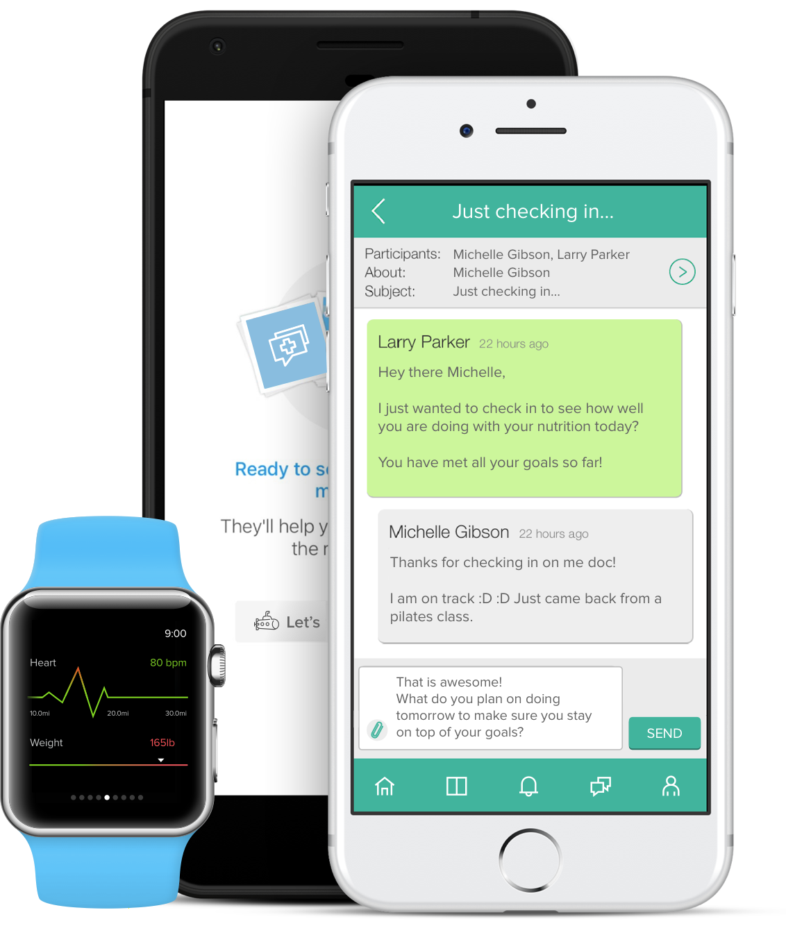
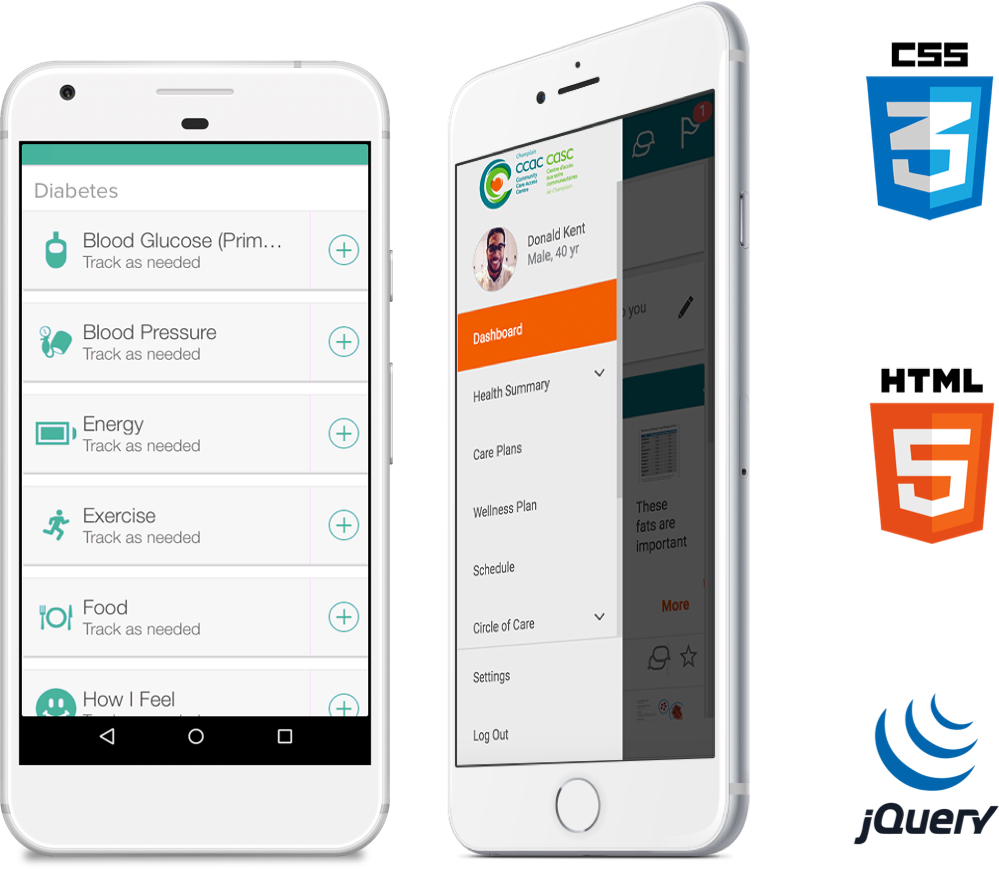
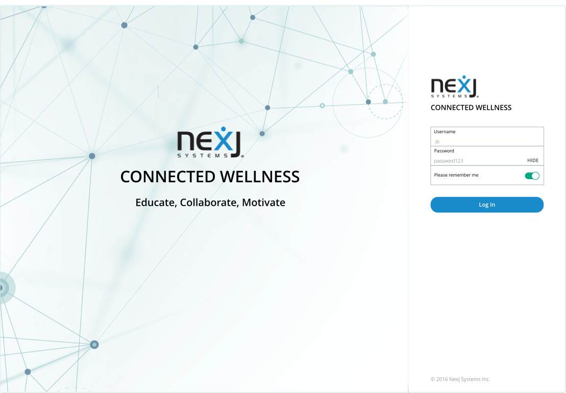
The task at hand was to create a digital platform for health management. As a UX developer, I worked hard to present complex health data in an intuitive manner. The work was done using an agile methodology with 2 week sprints. Design strived to be one sprint ahead of development to be able solidify UI/UX before hand offs. View product site.
Technologies
  • HTML5/CSS3/LESS
  • JAVASCRIPT/JQUERY
  • MONGODB
  • SKETCH
Solutions Provided
  • RESEARCH
  • INFORMATION ARCHITECTURE
  • INTERACTION DESIGN
  • VISUAL DESIGN/PROTOTYPE
01
Research
My research included competitive analysis and discovering the userbase’s demographic and use cases. Evaluating competing product’s usability and interaction design and understanding the audience helped to optimize the application's UX.
Competitive Research
Some of the UI/UX references we evaluated.

Find the right fit

Get paired with the right health provider.

Prevent illness

Treat yourself well: one step ahead.

Doctor's notes

Access visitation notes afterwards.

Ask questions

Get faster answers from your doctor.

Understanding user needs
Grasping user's needs/goals optimized UX.
User flow
Snippet of onboarding user flow.
02
Information Architecture
Creating the navigation structure of a content intensive application required me to evaluate several different navigation models. Initially the menu was to be a top-of-screen horizontal menu. However, competitive research and audience feedback indicated we should use a left navigation scheme to surface multiple levels of navigation. I suggested this menu be collapsible - the intent was that navigation could primarily be accomplished via content within the page. At this stage I also worked through user flow details.
03
Interaction Design
Wireframes
When creating wireframes I triumphed over several design challenges. For instance, I had to display very complex data in a clear and visual manner within the dashboard. Thus began my search for the most appropriate data visualizations. I explored different kinds of charts and how they would function in context of one another. I also drew inspiration from my past experiences, best practices, UX frameworks, charting libraries and examples in online articles/textbooks. This stage involved many discussions with stakeholders.
UX decisions
UX decisions involved evaluating trade offs between different components.
These wireframes displayed the layout of the application's content and how the user will interact with it. We explored a number of options and conducted several iterations in order to expertly display information. Each layout and interaction decision was supported by concrete UX reasoning and justification.
04
Visual Design
I worked closely with the visual designers to make sure that this stage followed the UX suggestions mentioned in the wireframes and didn't introduce any UX detractors. The result: a fresh and appealing app that is also usable. Sample visual mock I made can be seen on the right.
Mobile and desktop wireframes ensured optimized UX for any screen.
As a UX developer, I knew how important it was to utilize a grid system.
I checked color contrast ratios to make sure they satisfied the accessible contrast guidelines.
05
Prototyping
I created prototypes by translating designs (and wireframe concepts) into code. Prototypes I worked on included: fully functioning navigation, microinteractions, dialog boxes, tooltips and the entire Health Library page (this involved implementing a grid of interactive cards).
06
Results
As the project moved into the development phase, I worked closely with other developers and quality assurance engineers to ensure that the information architecture, interaction design and visual design of the application was effectively translated into production. The final result was a innovative and engaging healthcare app.
Feeling healthy now?
SEE ALL PROJECTS