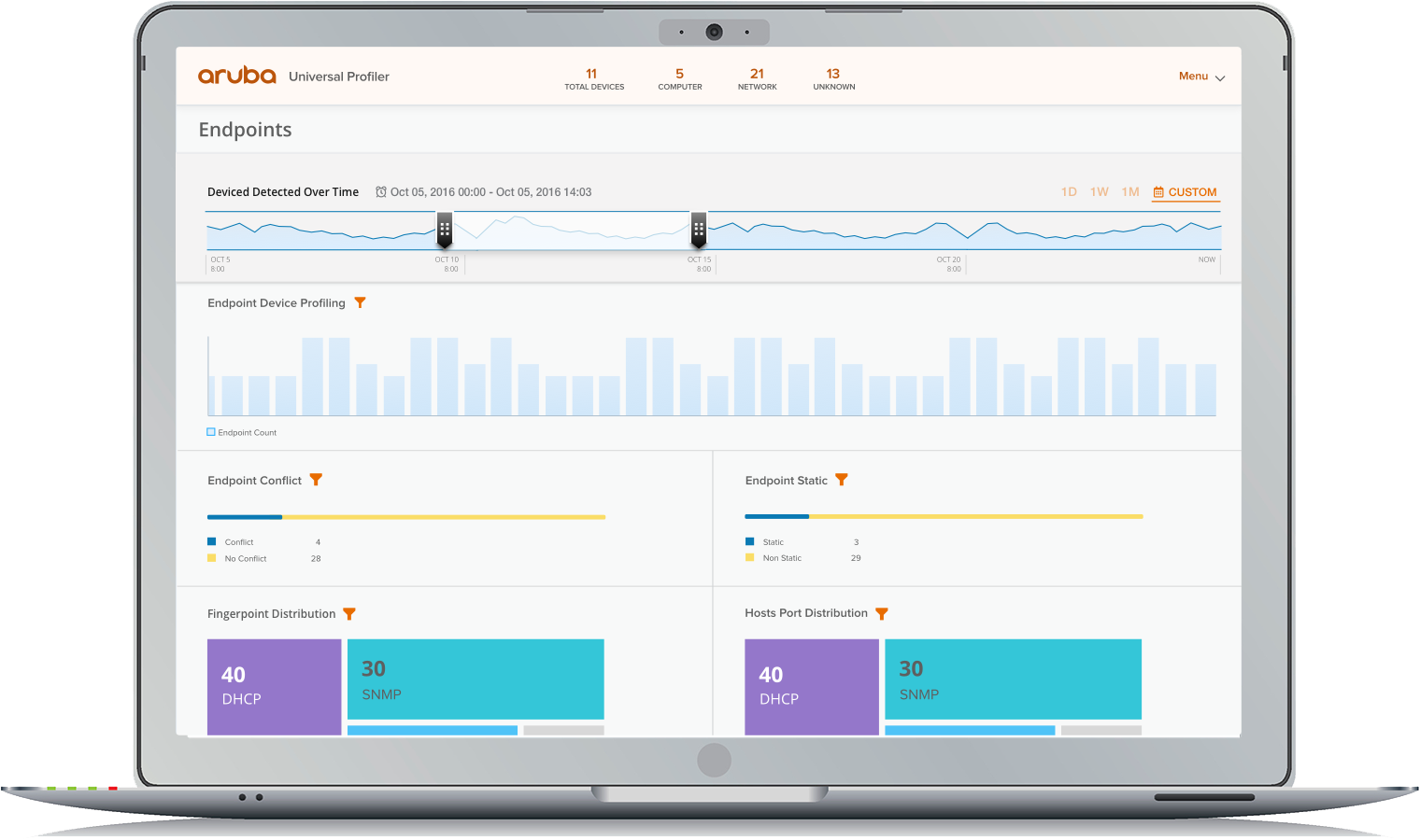
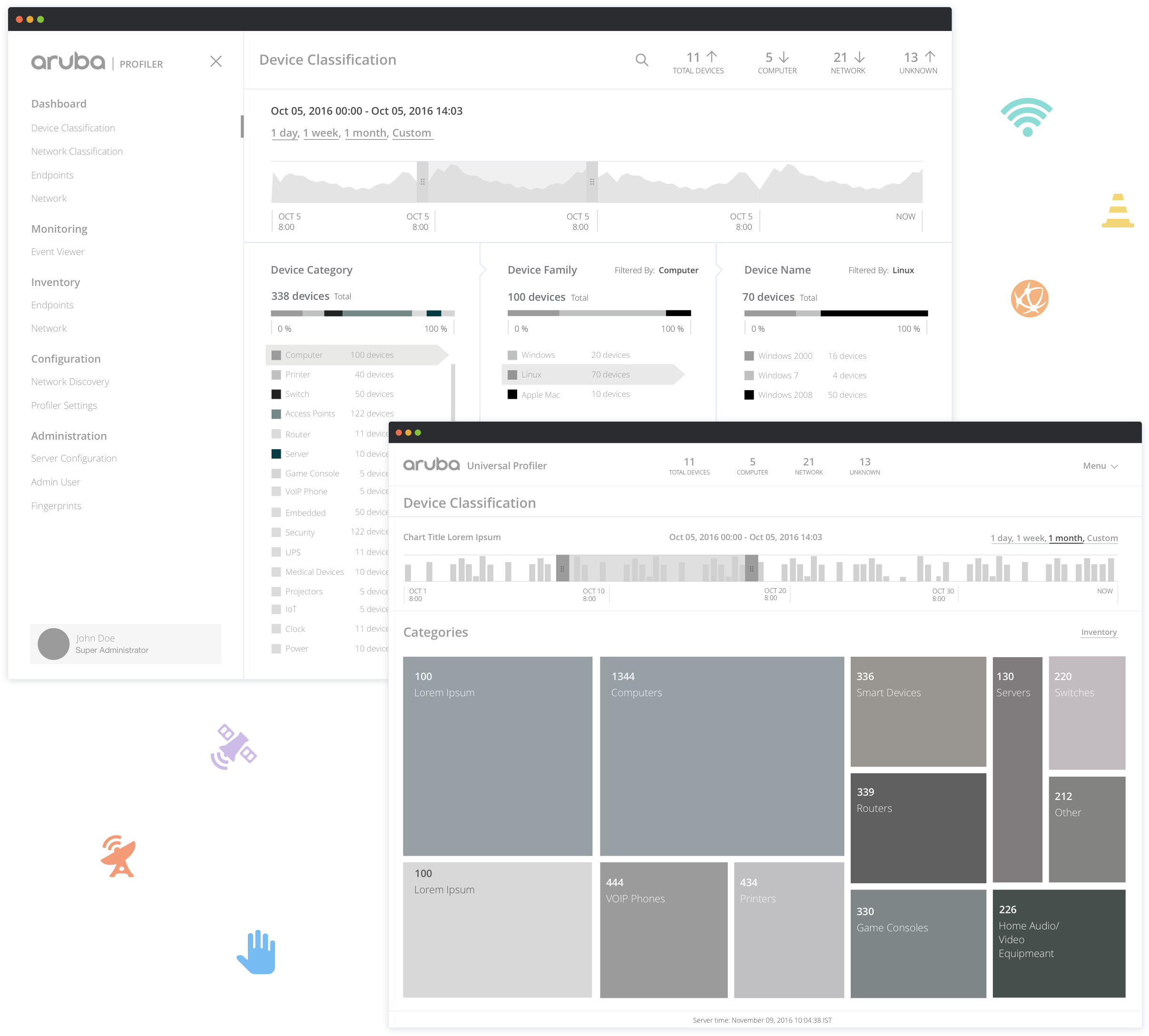
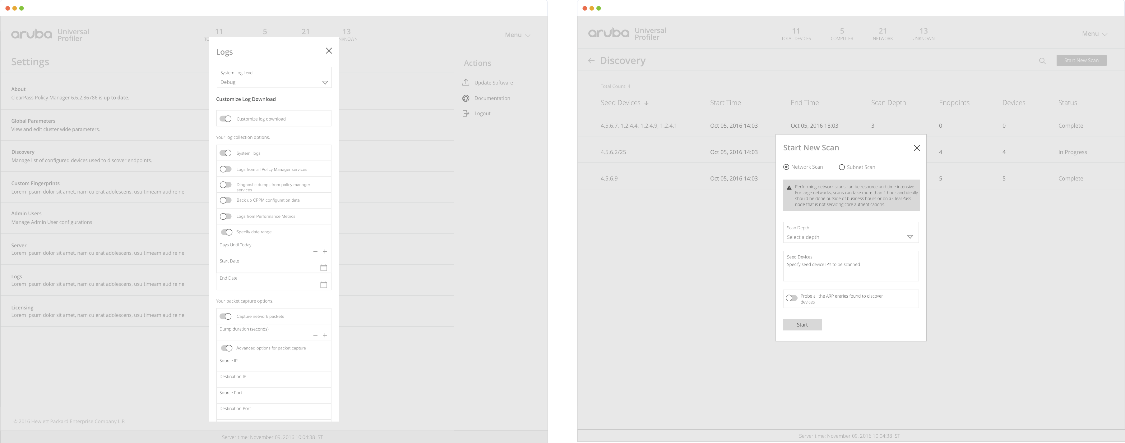
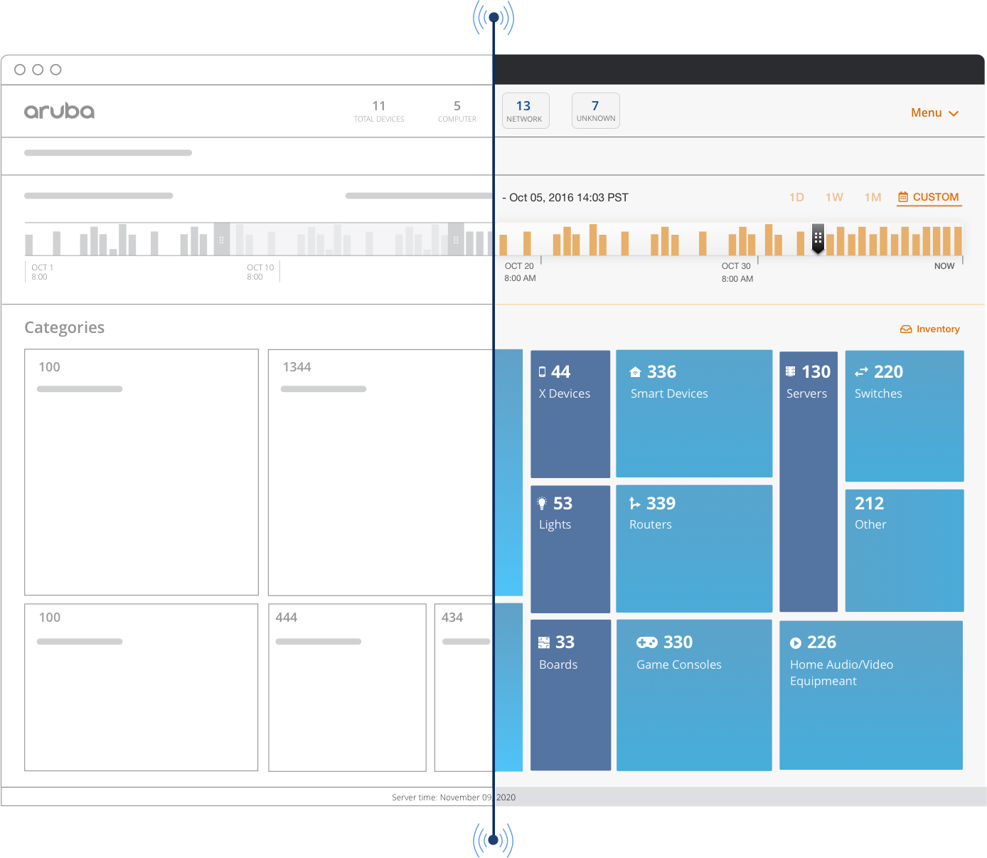
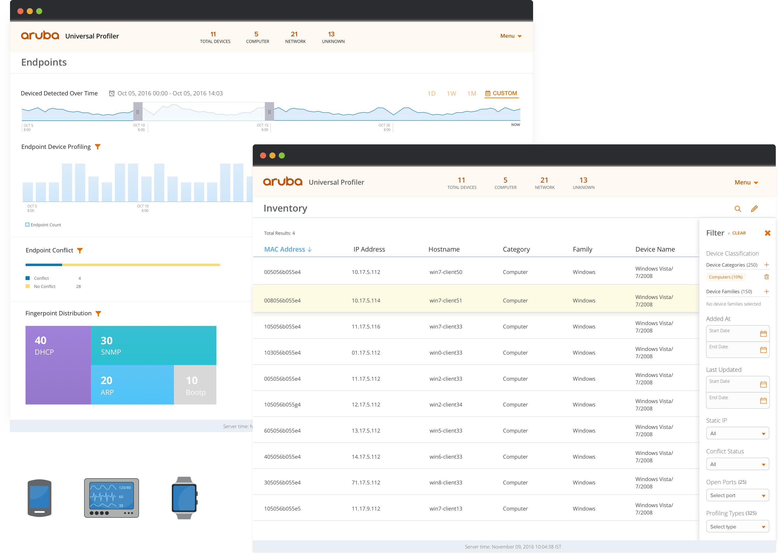
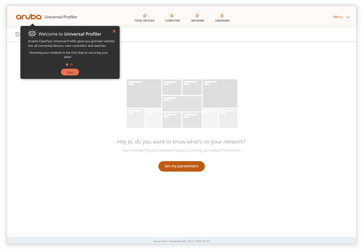
As the UI/UX lead, my task was to design the MVP version of the Clearpass App; this involved working closely with HPE’s product, design and engineering teams. The application’s main features included device and user discovery, wired and wireless access control, attack detection and adaptive response – based on set policies. Aruba had core requirements available however many product features were shaped by ideas brought forth as a result of the UI/UX presentations.
Technologies
  • GROMMET FRAMEWORK
  • REACT.JS
  • INVISION
  • SKETCH
  • PRINCIPLE
Solutions Provided
  • RESEARCH
  • INFORMATION ARCHITECTURE
  • INTERACTION DESIGN
  • VISUAL DESIGN
  • MOTION DESIGN
01
Research
Having talked through the requirements with the PM lead, I focused on researching competitors (i.e. Microsoft MCAS, Zingbox) and understanding the main persona’s we were targeting. This research provided insights and valuable ideas that I later used in the project.
REFERENCES
Some of the UI style references gathered for project.
Getting Familiar with Grommet

Throughout this project I had to work very closely with HPE’s Grommet design team. The Clearpass App would be implemented using Grommet React components thus I had to familiarize myself with their design system in order to ensure a smooth Engineering handoff. I didn’t want to be constrained by the basic Grommet components so I took it upon myself to explore within CodePen how customizable the components could be. I was able to build upon and extend the components and therefore had a solid understanding about what was feasible to design.
NAVIGATION
One of the navigation options highlighting key stats.
02
Information Architecture
One of the tasks during the IA stage was to decide on the navigation experience. I employed the Hub & Spoke design pattern to promote a contextual navigation experience. This pattern would emphasize the importance of the dashboards from which users could drill down into pertinent sections. The navigation had to respond well to smaller device sizes, therefore all page headers consisted only of the most essential elements so that they would be mobile friendly.
03
Interaction Design
Diving In To Wireframing
In this phase I utilized user task flows that I had created during the information architecture stage in collaboration with the product team. The visual representation of the user journeys reduced the number of revisions needed during wireframe reviews. My initial wireframes were low-fi hand sketches which evolved to hi-fi wireframes like the ones shown below.
The top-left image shows one of the first hi-fi wireframe for the Device Classification Dashboard. The user wanted the breakdown of device categories, device families and device names seen on network. The wireframe on the bottom-right was the final approved concept - it is visually appealing and interactive. It can be shown on a large screen in a security controls room or on a small cellphone.
ITERATING TO STRIKE GOLD
From initial concepts to final design, each iteration resulted in better UX.
Form Design & Dialog Boxes
There were several components that we needed within forms that were not initially available in Grommet. I worked with Grommet's design team to have these components introduced into their library. One such component was the calendar field within forms. A lot of attention was given to layout/ grouping of fields to ensure users could scan forms efficiently. A common question brought up during reviews was when to use modals and when to navigate to a new details page. In the world of UX, it is well known that modals don't scale well, however guerrilla user testing revealed that for many shorter forms modals were preferred.
GRAYSCALE WIREFRAMES
The best wireframe style is no style.
04
Visual Design
Along with UX design I was also leading the UI and visual design which included complying with Grommet’s design guidelines but at the same time adding to it when needed. Before diving in to the details of the visual design phase I put together several mood boards to define the app’s visual style. Based on feedback from the product and design team it was decided that the mood & style of the app was to be approachable, modern and tech-y; this influenced the color palette for the app.
There was significant debate between using a dark vs. light UI. The final decision was based on usability: black text on a light UI remains the most readable; the average user would not be spending large blocks of time reading long text heavy pages. Moreover, the application would be used primarily during the day (office hours). Keeping the aforesaid in mind the dark UI would not add much value.
I dug deep to ensure the user interface was kept as clean and simple as possible. All links were consistently styled, icons carefully crafted and interactive elements had appropriate signifiers.
Once the high-fidelity designs were approved, I shared clickable prototypes on InVision for the developers to inspect. I added contextual comments to communicate expected behavior; doing so streamlined the handoff.
LIGHT UI FOR A HEAVY APP
The app housed a lot of data and exposed complex filtering capabilities.
  • Integrated Onboarding
    Onboarding is an important part of UX design because it encourages your users to stay with you. Users did not want isolated walkthroughs and wanted to enter the app straight away. My design solution allows users to learn about application features in an integrated and unobtrusive way.
  • Fun Graphics
    I paired animated graphics (in this case the submarine) with simple text to make the tour less dreary and encourage the users to proceed to the next step.
  • Exit Anytime
    At any point the user can end the tour by clicking the x icon. The user can clearly see at what stage in the tour they are at. They can skip to any step by clicking on the circle icon representative of the step. The user can also navigate sequentially via the the Next and Back buttons.
  • Action Driven Tips
    Previous steps in the tour pointed out important UI components and features in the application. Some tour steps include action-driven tooltips, these are very engaging! I used hand drawn arrows to lighten the mood of action driven tooltips.
  • Help Cues
    All help cues are shown immediately after the tour ends. This screen shows an activated multi page cue. The cues have a subtle pulsing animation to ensure the users know they are interactive and waiting to be opened.
05
Interactive Components
At the finish line, I used the Principle app to animate components. To create these animations, I followed the guidelines from Material Motion, IBM’s Animation Principles, and The UX in Motion Manifesto.
I also created a style guide highlighting new components added during this project to the Grommet framework (approved by Grommet’s design team).
06
Results
As the lead UX designer, I presented complex data cleanly, creating an intuitive taxonomy and improving user flow. The clickable design prototypes were showcased at HPE Discover in London and received positive feedback. The redesigned Clearpass App is currently deployed in the large company networks, at over 7,000 organizations, in more than 28 different vertical markets.
Ready to explore more?
SEE ALL PROJECTS