The story behind

Zscaler’s flagship product, ZIA, delivers the complete security stack as a service from the cloud. ZIA was in need of an Operations Dashboard to get a synopsis of what’s going on in a network and easily spot issues. The dashboard had to be functional, beautiful, and provide an optimized UX.

Technologies
  • FRAMER
  • PRINCIPLE
  • INVISION
  • SKETCH
Solutions Provided
  • RESEARCH
  • INFORMATION ARCHITECTURE
  • INTERACTION DESIGN
  • VISUAL DESIGN/PROTOTYPE
01
Research
This was a very agile project with a tight design deadline, to ensure that my designs would be feasible for the first release I had do talk to developers to understand what data could be readily fetched from the backend. There were certain API limitation and performance considerations that I had to be aware of which shaped my decisions going forward.
Be aware of engineering limitations.
Understanding dev. limitations ensured I designed appropriate components like the one above.
I thoroughly researched competitor's dashboards to get an understanding of the various content structures, visual elements, key performance indicators and widget groupings that were utilized.
Just like for any other project I wanted to understand the main users inside-out. I conducted interviews with sales engineers/end-users and analyzed existing user analytics to gain a better understanding of the target audience. Two primary personas identified and kept in mind for the duration of the project were: security professionals and app admins.
Understanding Zscaler’s Data Forwarding.
Zscaler’s unique cloud architecture affected how information would be grouped within widgets.
02
Information Architecture
A solid information architecture is essential for good UX. I wanted to tell a cohesive story via the dashboard about the health and status of the network . In order to do this I had to understand several areas in the app from which useful data could be pulled. The remaining portion of this phase involved summarizing, grouping and prioritizing the plethora of information available and ensuring a logical flow as the user scanned the dashboard.
03
Interaction Design
Wireframes
The wireframing stage included brainstorming ideas with product and engineering teams and creating draft wireframes on the whiteboard. I then started working on very low fidelity wireframes to be able to focus on the content hierarchy and information architecture without having to think about making everything look visually perfect, yet. By delivering work in different fidelity layers (low to high) I was able to quickly get feedback and test my UX hypotheses on which visualizations, interactions and drill downs served real users the best.
Some insightful feedback that affected the dashboard layout included:
  • Users wanted big bold stats at the very top of the page.
  • Users wanted a geographic representation of traffic distribution.
  • Reviews with the API team revealed that at the time only certain data sets could be fetched in real time.
  • Users wanted a brief explanation translating what each widget was visualizing.
Allow for multitasking.
Smart data groupings allowed for users to scan multiple graphics simultaneously.
Memorable data visualizations.
Using appropriate visualizations with necessary interactive capabilities was critical.
04
Visual Design
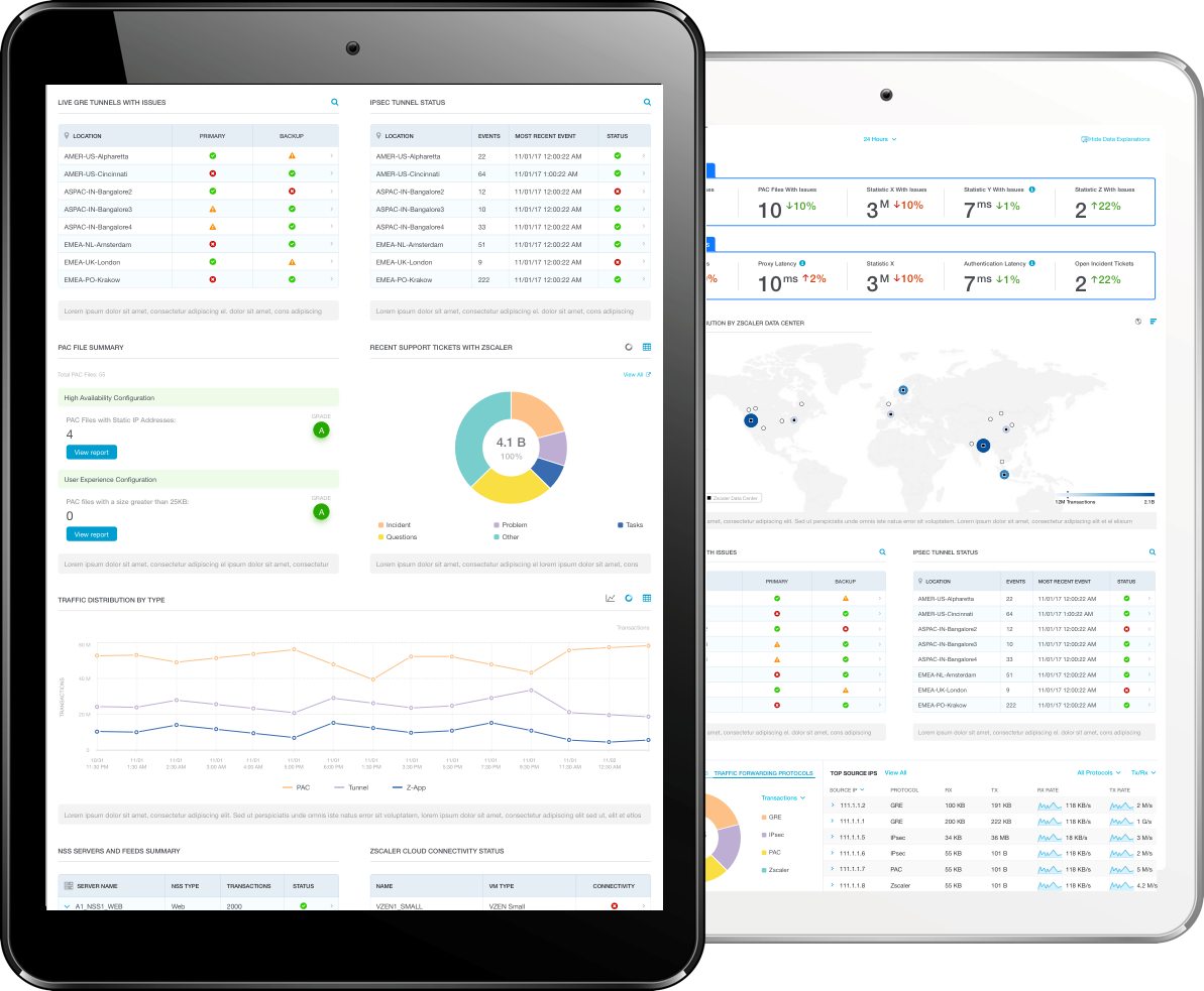
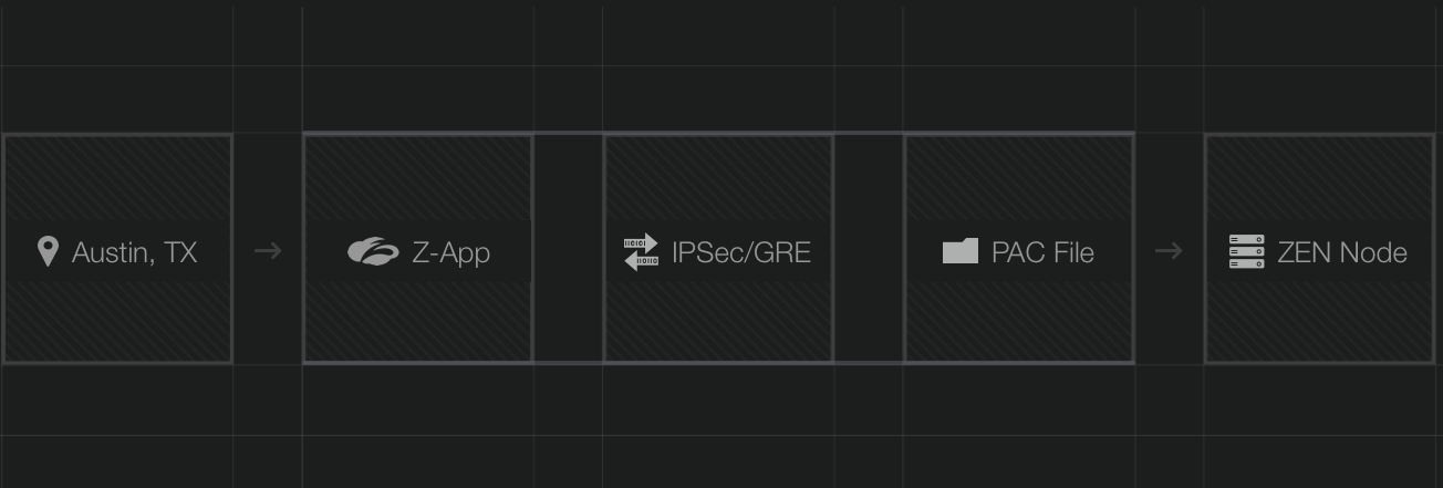
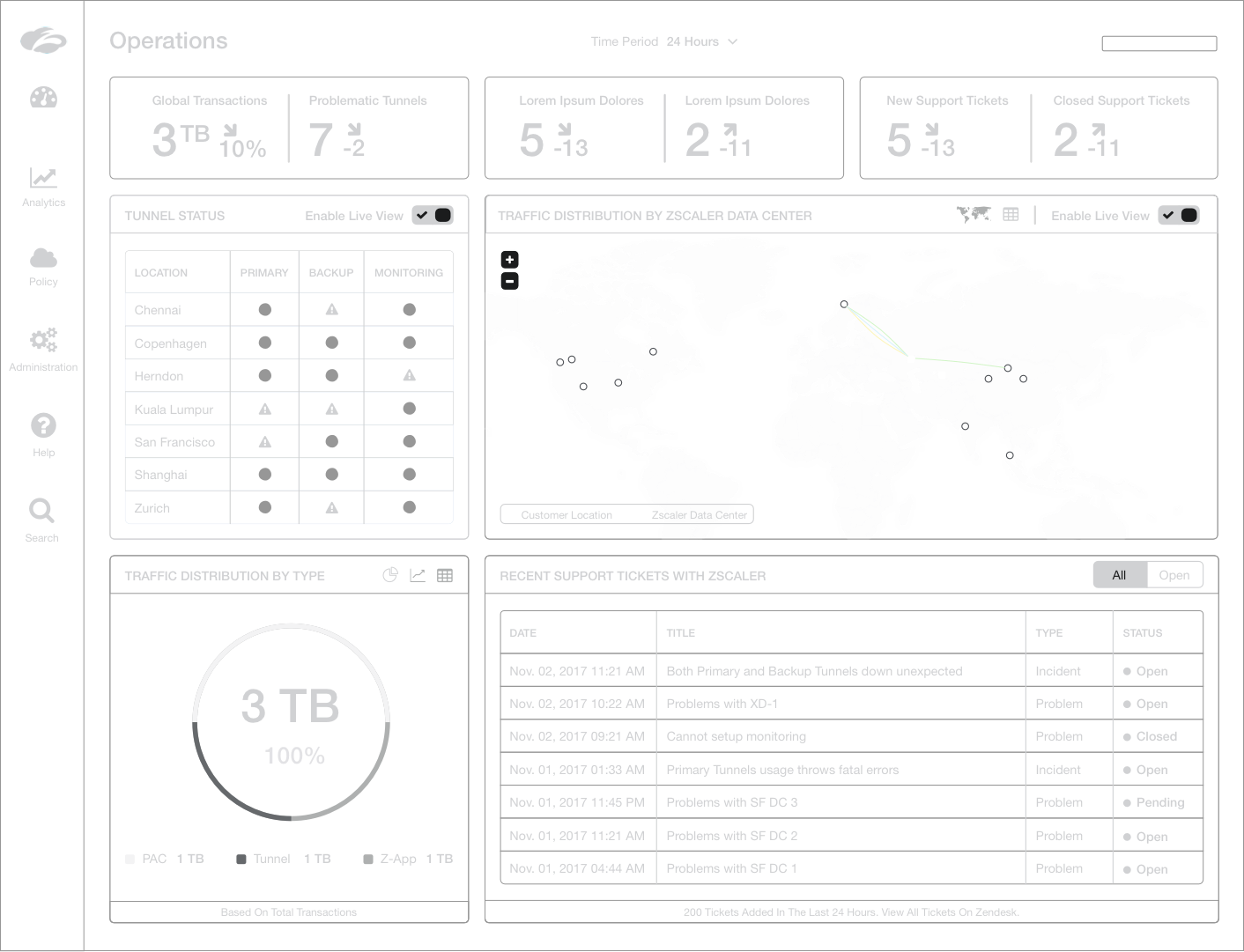
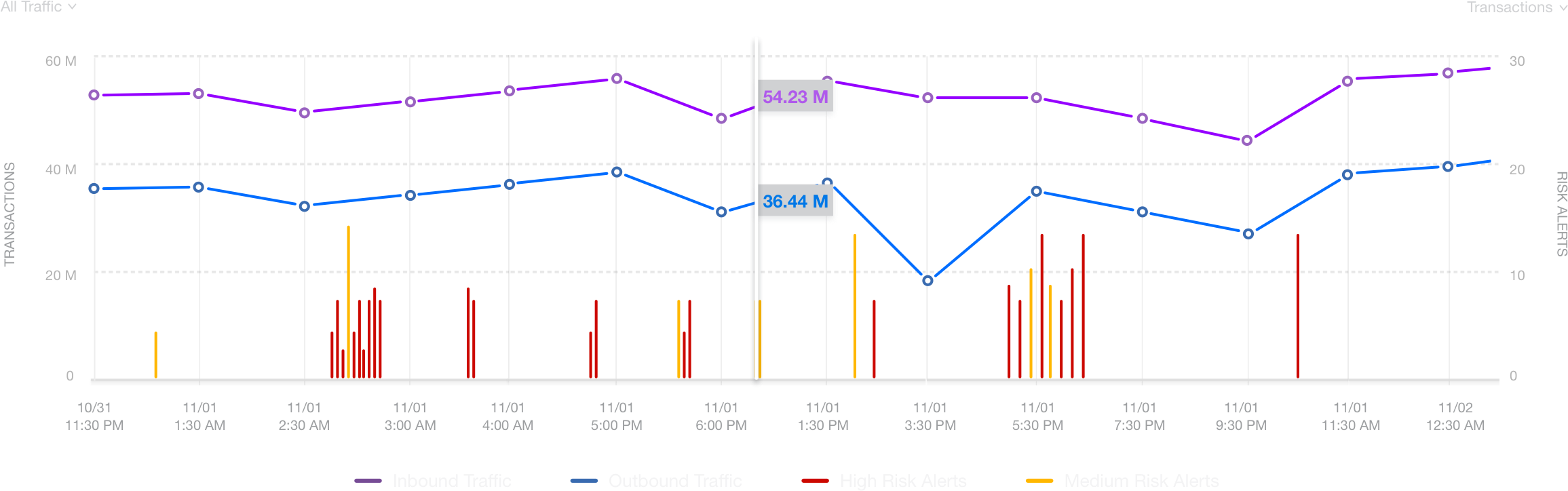
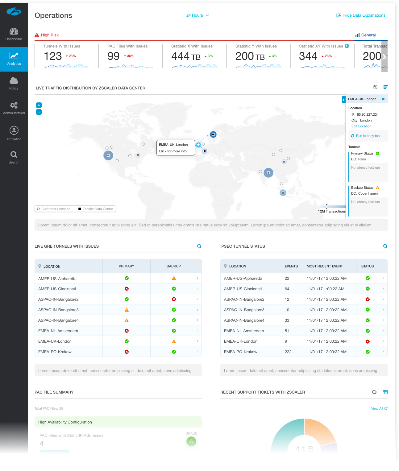
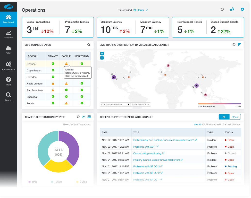
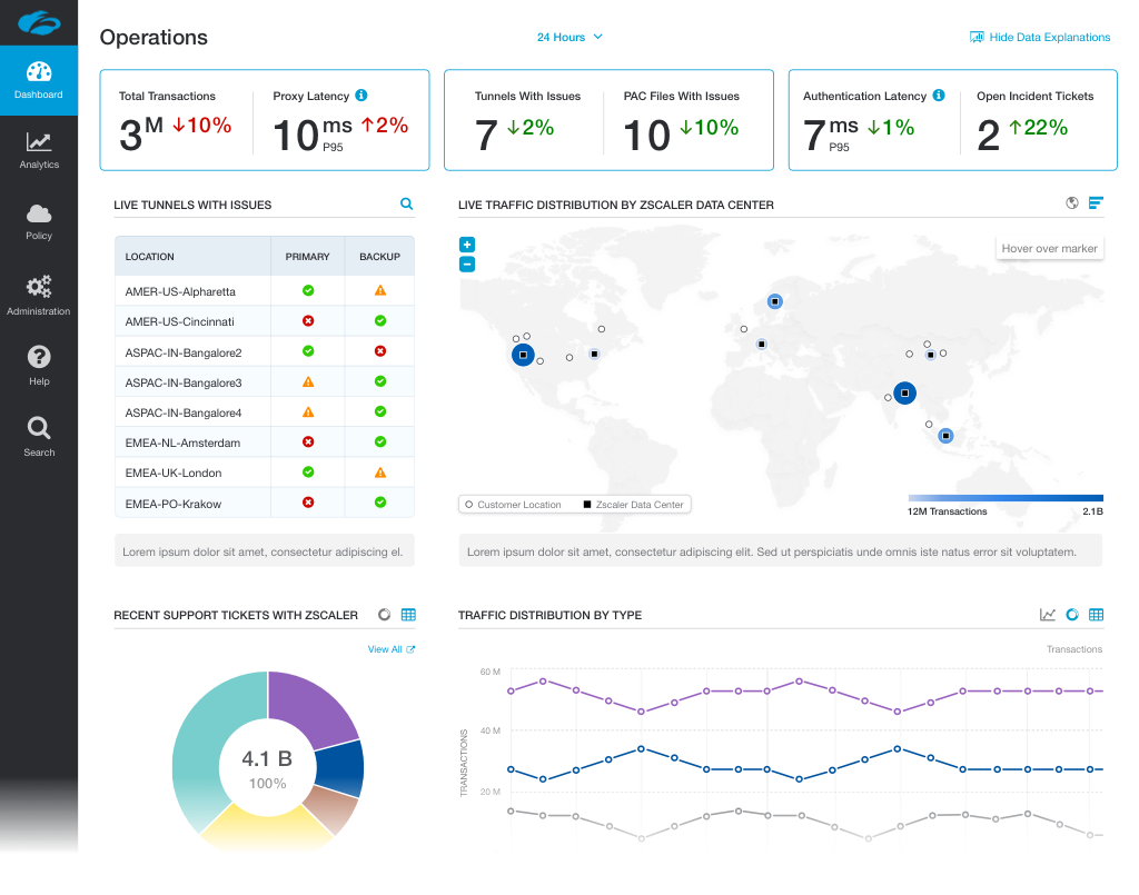
As soon as I had finished doing the wireframes and mapping out the Information Architecture, I created a Style Board to set the right visual tone of voice. I wanted the style to feel professional yet light weight and effortless. We already had existing dashboards however they looked outdated and in need of a revamp, thereby granting me extensive creative freedom. I still had to make sure the dashboard aligned with core characteristics found in our style guide; including the existing color palette, typography, icon-style and grid system.
I tested several color combinations, spacing and widget styles. The clear navigation structure and visualizations I layed out during the earlier stages was enhanced by utilizing the right visual design.
Colors are a key factor in user decisions.
Appropriate color combinations were utilized throughout for easy scanning.
Testing widgets with shadows.
Surveys revealed that our users preferred flat widget design as opposed to widgets with shadows.
Arriving at the final design style.
A flat design with explanations for each widget (with an option to hide) was a win with our users.
05
Prototyping
I initially used Principle to present the designs to senior executives and highlight the interactions and drill down options.
To test the prototypes with users I utilized Framer since it allowed for more advanced animations such as the loading animation seen in the adjacent animation.
Subtle micro interactions such as animating the search icon into a cross once the serarch field receives focus had a huge role in making the dashboard feel dynamic.
The interactive Framer prototypes of our final designs helped us hone in on which interactions the users preferred. I made all the final dashboard widget interactions/animations modular while coding in Framer so that other designers could easily reuse and customize them in other dashboards within the app.
06
Results
Zscaler needed a intuitive and clean dashboard - that was going to display a lot of data. The final dashboard had multiple data visualizations that the user could easily follow and interact with. The qualitative user feedback was overwhelmingly positive and the average task completion rate was 89% based on a sample size of 20+ users.
Feeling secure now?
SEE ALL PROJECTS